
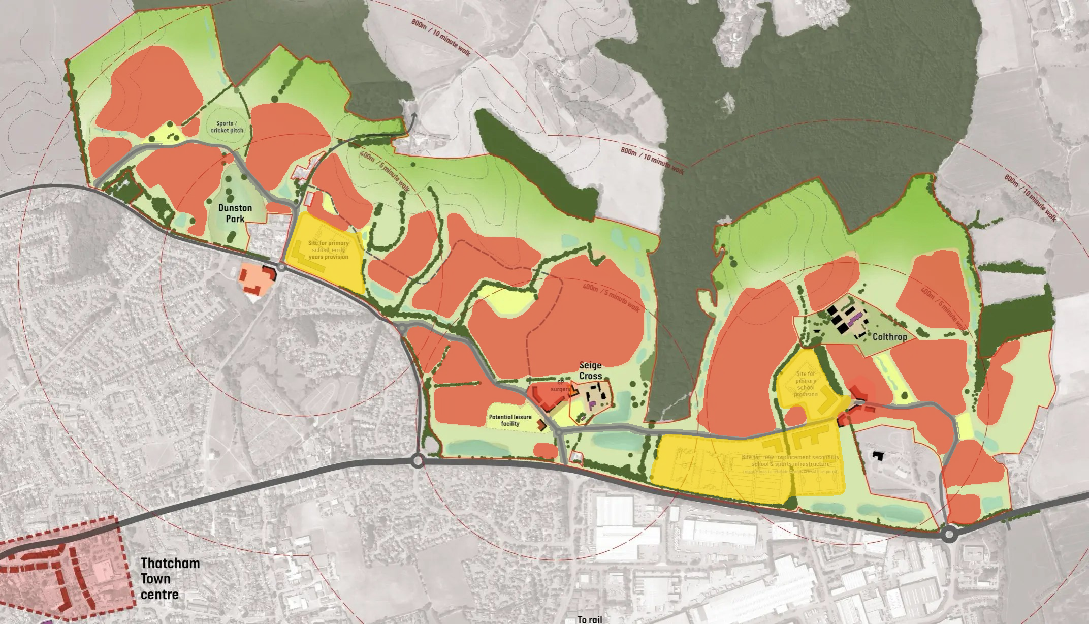
The map and what they want you to see
The NE Thatcham Partnership’s website centres around two big bold maps of the site, with relatively little written content. These maps are drawn in a way which presents the most positive view of the development, implying that all the statements and figures are backed up with rigorous facts and evidence and we should accept them as being true without too much thought.
On closer inspection, the map tells us three things:
- One of the three promised new local centres is Bradley Moore Square - which is not new at all
- The site is not nearly as close to the station as the website states - so traffic impact will likely be higher than planned
- The actual percentage of genuine green space is significantly lower than the 50% promised - because a roadside verge or small patch of grass shouldn't count
In this blog I want to break down the realities these maps hide on first glance. As usual I have used free and open data and presented all my findings objectively so you can make your own mind up.
You can see the maps on the NE Thatcham Partnership’s web page, and I have included them here too (click to expand):
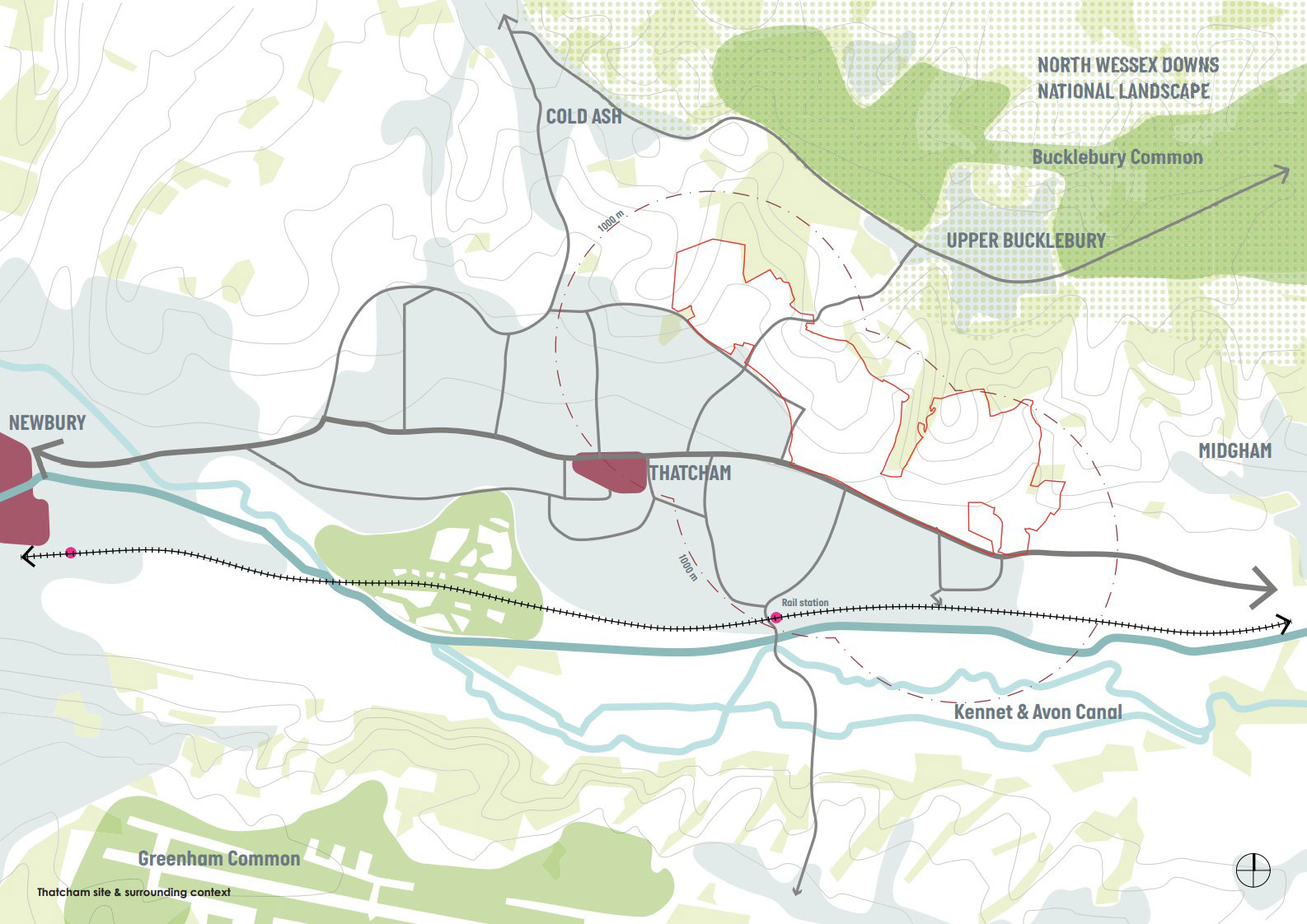
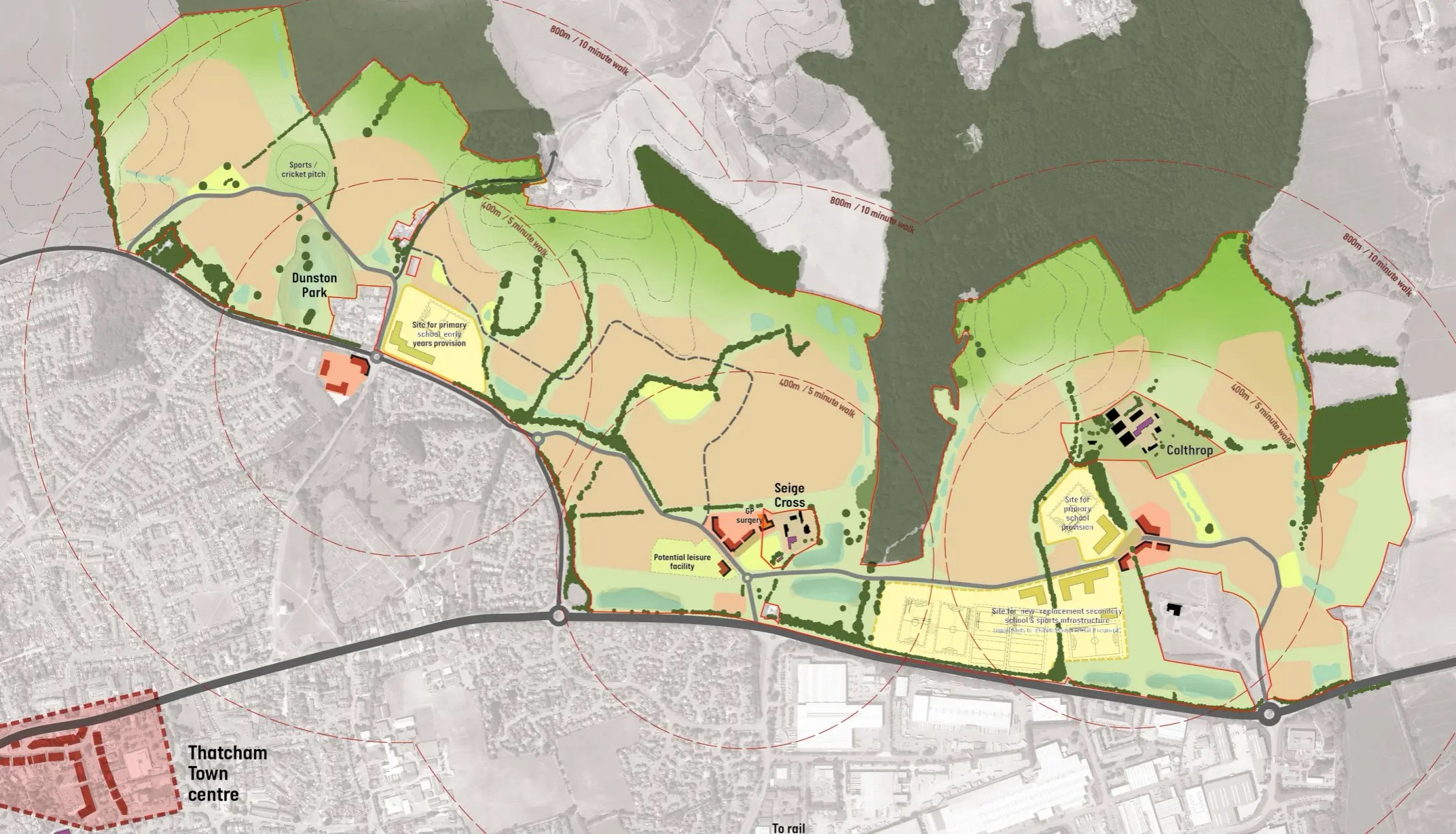
Maps: nethatcham.co.uk / NE Thatcham Partnership
Now let’s look at the numbers.
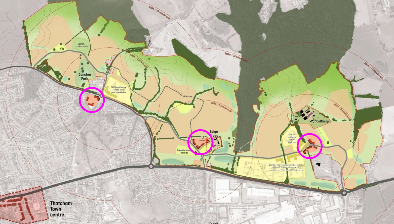
1. Three new local centres?
The developers’ vision promises “three linked but distinct neighbourhoods: Dunston Park, Siege Cross and Colthrop Village,” each with its own local centre offering shops, services and community facilities. I hope you agree that sounds like three new centres built as part of the development.
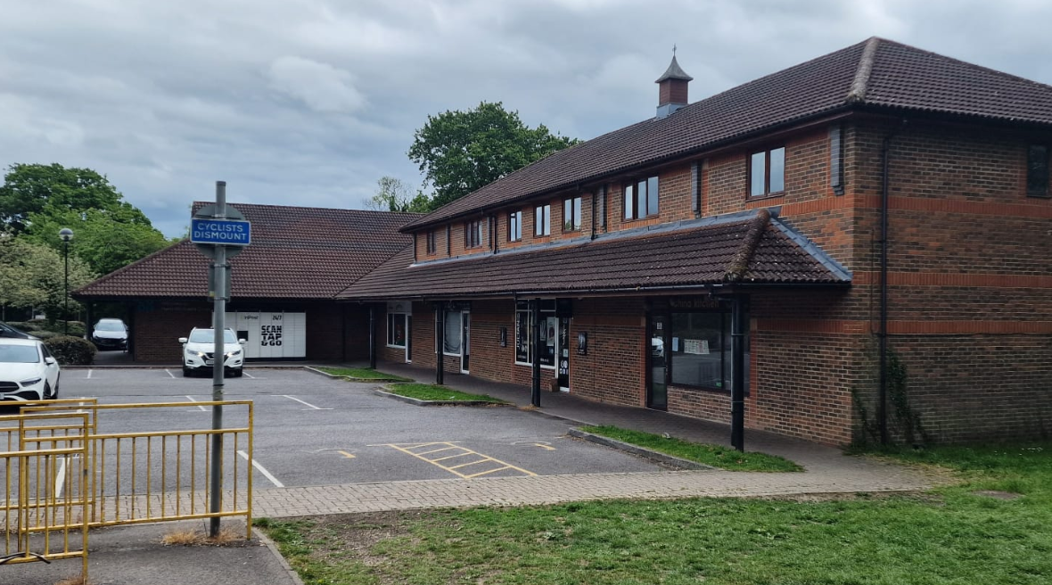
But look at the map. The local centre for Dunston Park is positioned at Bradley Moore Square, home to The Mill House pub and the Co-Op. And Bradley Moore Square sits outside the SP14 allocation boundary entirely. It is existing infrastructure, built and paid for long before this development was proposed.
I find it highly unlikely that the developers will be investing huge sums of money to improve the facilities at Bradley Moore Square as it transitions into its role as centre of a new “distinct neighbourhood” - though to be fair, the NE Thatcham website does not explicitly rule this out.
2. Close to the railway station?
The exact phrase on the NE Thatcham site is “Thatcham railway station, approximately 1km from the site…”, reinforced by vague circles and distances on the maps themselves. This implies that houses on the site will be close to critical transport links - but that’s simply not true.
The claim of 1km is technically sourced from the closest point on the boundary of the allocation to the station. That’s the southern tip of the site, near the A4 - a small corner of land where the same maps show no houses will be built.
To understand how misleading this is, it helps to be clear about what I’m measuring here and how.
As the crow flies. The distances below are all straight-lines. This is the same approximation the developers have used and gives the most generous possible measure - it ignores roads, including the A4, and the fact that Thatcham’s street layout doesn’t offer a direct route. Real walking distances will be longer, typically by 20-40% (I’ll cover this later).
The closest point on the boundary (the southern tip near the A4, where nobody will be living) is 1,015m from the station. I can forgive them the extra 15 metres, as they do say “approximately”, but remember this is the shortest possible distance from the very edge of the site to the station, following an impossible straight line route.
If you break the whole site up into a 100m square grid and take an average of the straight line distance to the station, you get a much more honest view. Dwellings will, after all, be spaced out across the whole site. Doing this calculation tells us that no part of the site is within 1km of the station. Zero percent. The orange line on the map above shows the distance to the centre of the site. The red line shows the longest possible distance. Every resident will be somewhere in this range.
Here are some more realistic “as the crow flies” estimates of the distance:
| Map | Location | Straight-line distance | |
|---|---|---|---|
| Developer’s claim | 1.0km / 0.6 miles | ||
| Closest point on boundary | 1.0km / 0.6 miles | ||
| Site centroid | 1.5km / 0.9 miles | ||
| Furthest point | 2.5km / 1.6 miles | ||
| Average across site | 1.7km / 1.0 miles |
Actually quite a long walk!
Let’s look at how long it will really take, based on the data we have today. The map below shows routed walking times from three representative points on the site to the station, using real footpaths and roads via OpenRouteService.
Each route has two stages. The solid line is a real navigated route from the site boundary to the station. The dashed line is an approximation of the walk from within the development to the boundary - no street-level plans exist yet, so I have estimated a straight-line path from a plausible residential location in each area. Straight-line paths are shorter than any real street route, so my estimates are optimistic: actual walking times will be longer.
| Map | Route | Within-site (straight line, approx) | Routed walk (OpenRouteService) | Total distance | Total time |
|---|---|---|---|---|---|
| Central (near Piper’s Way) | 0.4km / 0.3 miles (5 min) | 1.3km / 0.8 miles (16 min) | 1.7km / 1.1 miles | ~20 min | |
| East (near Crematorium) | 0.4km / 0.2 miles (4 min) | 2.3km / 1.4 miles (27 min) | 2.7km / 1.7 miles | ~32 min | |
| North (near Bradley Moore Square) | 0.6km / 0.4 miles (7 min) | 2.4km / 1.5 miles (29 min) | 3.1km / 1.9 miles | ~36 min |
3. 50% green space?
You’d be forgiven, when looking at the map on the NE Thatcham website, for saying something like…
“It doesn’t look so bad! Only 50% of the site is being developed and look, there’s still lots of green space!”
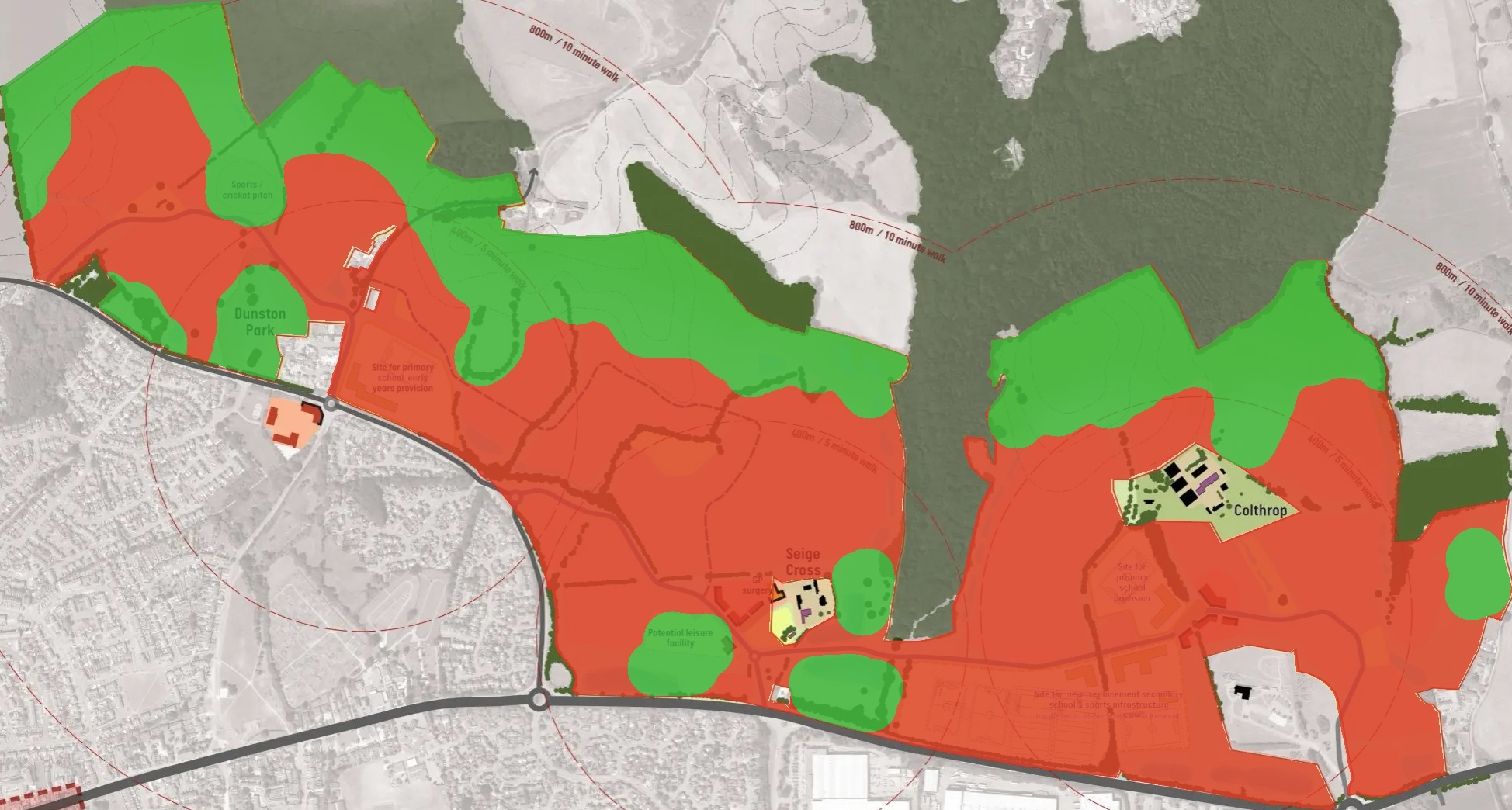
The masterplan map uses warm, muted tones - pale salmon for housing, soft yellows for schools, gentle greens for everything else. The effect is to make the whole site look like a pleasant pastoral landscape. At a glance it reads as mostly green. As you can see below, if you darken the colours a little, things look a very different.
Counting pixels on the map shows that nearly half the site is built development - though that figure is, if anything, generous to the developers: the sports pitches and “potential leisure facility” are shown in the same green as the surrounding countryside, so some of what I have counted as green space will in reality require land clearance and construction.
| Category | Share of SP14 site |
|---|---|
| Housing | 37.0% |
| Schools and community facilities | 8.9% |
| Roads and infrastructure | 2.3% |
| Total developed | 48.1% |
| Green space and water | 51.9% |
This is largely in line with the “50% green space” commitment that comes with the development. But it’s all based on a completely ridiculous assumption: that everything that isn’t a house, road or school is “green space”.
It’s not really “Green Space” though, is it?
A strip of grass 5 metres wide running along a road boundary counts as green space on a map, but it isn’t somewhere you’d take your kids to play!
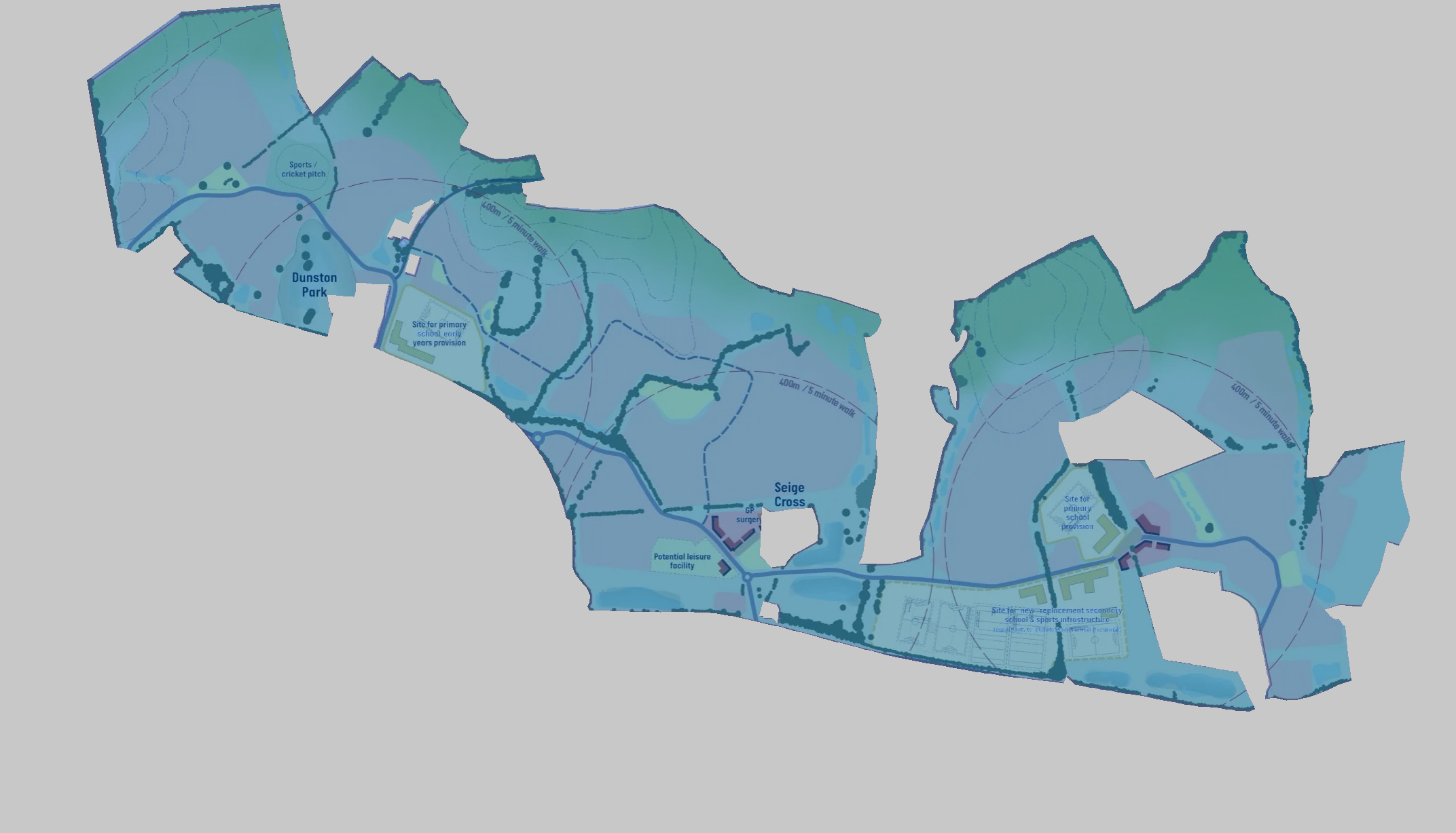
Let’s look at this from a different perspective. What if everything that’s not “green space” was “development”? Let’s turn things on their head and see what happens. Rather than assuming everything outside the little red bubbles of new houses is green and pleasant land, let’s assume that everything that isn’t large enough for a modest game of frisbee has been consumed by the development.
I came up with a passable definition of what I consider to be green space: If I stand in the middle of a field and there is 50 metres of green around me (no roads, no buildings, no school fences) then that whole 100m wide circle is green space. If I stand on every spot in the development and repeat that test, I get a new map. A map that shows where the real green spaces are.
Applying that test to the green areas on the masterplan:
Dark green: open green space wide enough to pass the 50m test. Red: everything inside the site boundary that does not - developed land, roads, and narrow strips.
Of the 89 ha of green space shown on the masterplan, only 58 ha passes the 50m test. The remaining 31 ha is slivers, verges, and strips - green on the map, but not open space in any practical sense. Disjointed and cut off from surrounding countryside, these leftover patches and strips make poor habitats for wildlife too.
The developer’s headline claim is that roughly half the site is green space. Strip out the unusable slivers and the picture changes dramatically:
It’s just an illustration
I would guess that the NE Thatcham Consortium would laugh off my analysis and say I’m reading too much into a document that’s designed only as an illustration. I find it very unlikely though that they would present a map that overstated the impact on the town and surrounding countryside at this stage of the process. I think this map gives more away than it’s author hoped it would.
To me, this map, however accurate it may be, highlights the importance of setting very strict planning constraints around this project which ensure that whatever is built here genuinely benefits the town.
Thatcham deserves better than what is presented here!
How I did the analysis
Expand below if you’d like more detail on how I arrived at these numbers.
Image analysis
Step 1: identify the site boundary. I use the official SP14 allocation boundary polygon (the same polygon plotted on the maps above, in WGS84 coordinates from the local plan data). I fit this polygon precisely onto the masterplan image to create a pixel-level mask of the site interior, with the five internal exclusion zones (existing pockets of land not part of the allocation) punched out.
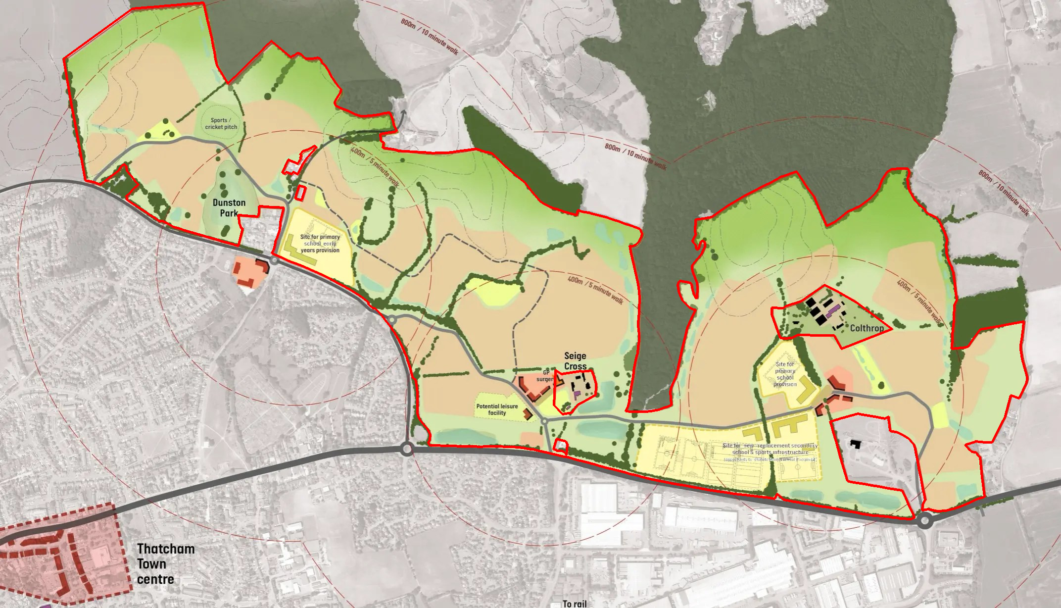
Left: the SP14 boundary polygon (red) fitted to the masterplan image - note Thatcham town centre (bottom-left) falls outside. Right: the resulting site interior mask (blue) with the grey background excluded.
Step 2: classify each pixel by colour. Within the site boundary only, each pixel is classified by its RGB values into housing (salmon/red tones), schools and community facilities (yellow tones), roads and infrastructure (grey tones), or green space and water (everything else).
Step 3: count. The two images below show the result - every pixel recoloured by category (left), and the same categories overlaid on the original so you can see exactly what has been detected (right).
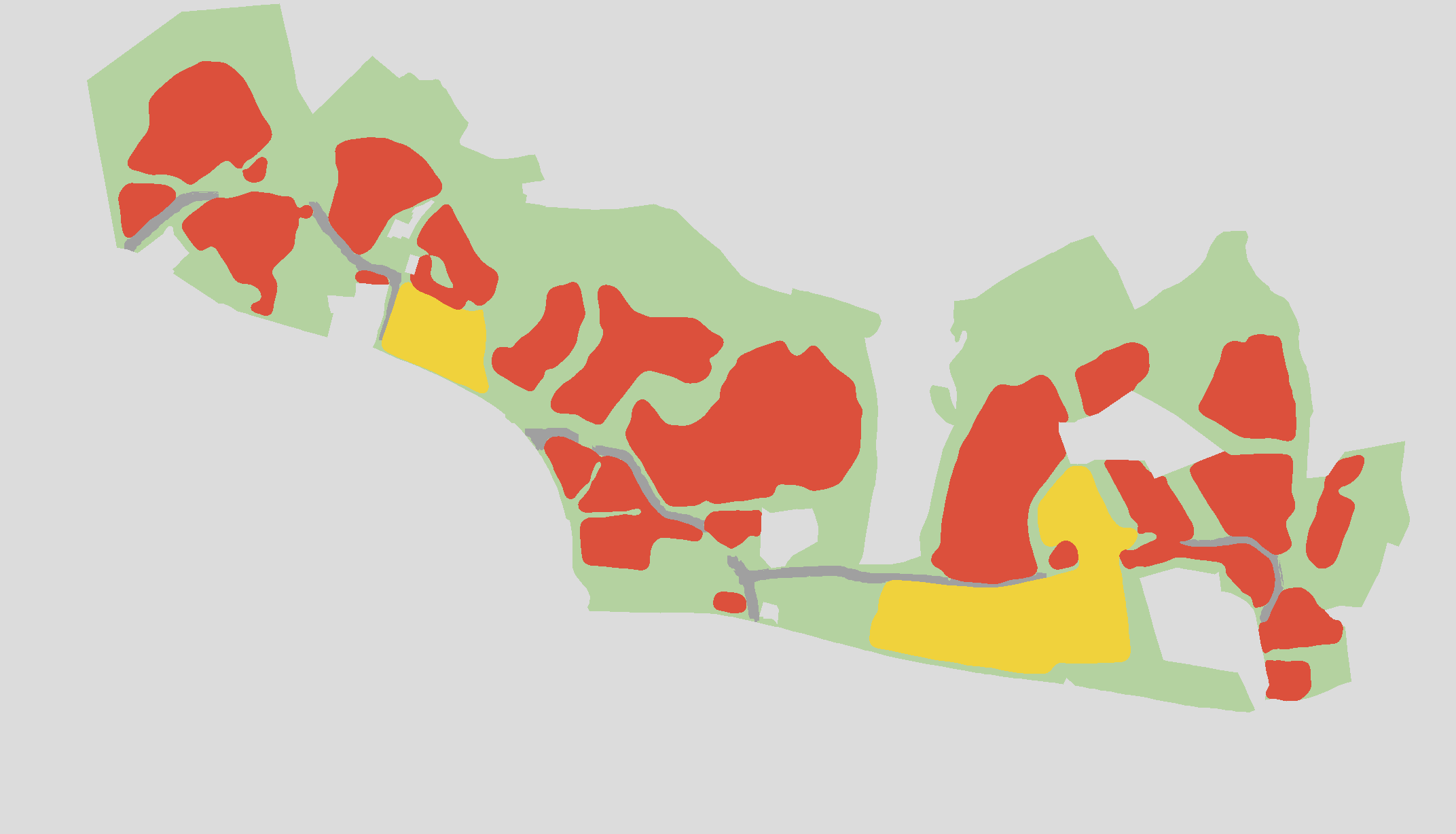
Left: full segmentation - red: housing, yellow: schools/community, grey: roads, green: remaining space. Right: same categories overlaid on the original masterplan.
Green space analysis
To identify meaningful green space I apply a morphological opening to the green pixel mask from the colour segmentation. This is equivalent to rolling a circle of radius 50m across the green areas: any part of the map the circle cannot fit into entirely is removed. What remains is green space wide enough in every direction to contain a 50m radius - wide enough that you are genuinely away from roads and boundaries, not standing in a verge or a corridor.